Posts mit dem Label _ART DIRECTION werden angezeigt. Alle Posts anzeigen

Freitag, 9. Dezember 2016

LE PLAISIR (Ophüls, 1952): Caleidoscopic frame fragmentation

Max Ophüls's LE PLAISIR is so brimfull of pure cinema, it is a perfect film to study. Cinematographers Philippe Agostini and Christian Matras often create frames within frames that visually separate or unite the precisely blocked characters.

Max Ophüls' LE PLAISIR ist ein Beispiel von "pure cinema", das zu studieren sich immer wieder lohnt. Die Kameramänner Philippe Agostini und Christian Matras unterteilen das Bild oft in weitere Unterkompositionen und Bildrahmen, welche die präzis aufgestellten Figuren auch visuell voneinander trennen oder verbinden.

[RV]

Multiple frames within frames show character relationships.

Freitag, 2. Dezember 2016

LA FILLE INCONNUE (Dardennes, 2016): cellphones and buzzers

Telephone conversations are a central storytelling device in Jean-Pierre and Luc Dardenne's LA FILLE INCONNUE. Most often we see - sometimes also hear - only one side of such dialogue scenes which automatically stimulates our imagination. While the cellphone is a pivotal prop, there is an aural emphasis on ring tones, buzzers and the like.

Telephongespräche sind ein zentrales Erzählstilmittel in Jean-Pierre und Luc Dardennes LA FILLE INCONNUE. Meistens sehen - manchmal hören - wir nur die eine Seite solcher Dialoge, was automatisch unsere eigene Vorstellungskraft aktiviert. Während das Handy das entscheidende Requisit ist, werden auf der Tonspur Klingeln, Vibriergeräusche und Ähnliches betont.

[RV]


Freitag, 18. November 2016

ONIBABA (Shindo, 1964): Wind [Post No.100!]


Shindo Kaneto's independently produced "modern parable" ONIBABA (THE DEMONESS) is mostly taking place "within a claustrophobic sea of grass" (quote from the Masters of Cinema blu-ray cover). And this sea of grass seems to be alive because of a constantly blowing wind. A very oppressive, strange but strangely beautiful film indeed.

Shindo Kanetos unabhängig produzierte Parabel ONIBABA (Die Dämonin) spielt grösstenteils in einem "klaustrophobischen Meer aus Gras", wie es auf der Blu-ray von Masters of Cinema treffend heisst. Lebendig erscheint dieses Meer aus Gras dank dem konstant wehenden Wind. Ein beklemmender, eigenartiger aber auch eigentartig schöner Film.

[RV] (not for everyone, though)


THE QUIET MAN (Ford, 1952): Wind

The exteriors of John Ford's THE QUIET MAN were largely shot on location in Ireland (in glaring contrast to the unconvincing studio sets for some of the horse race scenes) and sometimes under harsh conditions. The wind particularly adds to the realism and works quite well as a metaphor for heightened perception and inner turmoil, of course. The wind during the stormy kissing scene that Spielberg borrowed so memorably for E.T. (1982) is probably all smoke and mirrors (aka wind machines), though.

Die Aussenszenen von Fords THE QUIET MAN wurden grösstenteils unter nicht immer einfachen Wetterbedingungen wirklich in Irland gedreht (im Gegensatz zu den unsäglichen Studiosets für einige Szenen während des Pferderennens). Speziell der Wind trägt viel zum Realismus bei und funktioniert natürlich gut als Metapher für intensivere Wahrnehmung und innere Aufgewühltheit. Der Wind während der stürmischen Kussszene, die Spielberg so einprägsam für E.T. (1982) verwendete, ist hingegen wohl eher Schall und Rauch aus der Windmaschine.

[RV] 

Apparently, Maureen O'Hara went through a lot on the sets of this film.

Freitag, 11. November 2016

FRANTZ (Ozon, 2016): Subliminal Color Changes

The less one knows about François Ozon's brilliant black and white movie FRANTZ the better its twists and turns work. It is safe to say, however, that the film makes use of color in connection with flashbacks in a simple but unexpectedly subtle way.

Je weniger man über François Ozons starken Schwarzweissfilm FRANTZ weiss, desto stärken wirken die überraschenden Wendungen. Nur soviel: der Film setzt Farbe im Zusammenhang mit Flashbacks in einer einfachen aber überraschend subtilen Weise ein. 

[MS]

While the promotional materials strictly showcase the films gorgeous black and white photography, colors are not completely absent.

Freitag, 12. August 2016

RAN (Kurosawa, 1985): Costumes and Colors

Like KAGEMUSHA (1980), Kurosawa's RAN has brightly colored fabrics and costumes in abundance. The protagonist's three son and their respective armies are distinguished by primary colors red, blue and yellow, while the other characters wear more or less subdued colors or patterns depending on their importance and role within the overall drama.

Wie in KAGEMUSHA (1980) gibt es in Kurosawas RAN stark farbige Stoffe und Kostüme in Hülle und Fülle. Die drei Söhne des Protagonisten sowie ihre jeweiligen Armeen sind dank den Primärfarben rot, blau und gelb auch in den Totalen unterscheidbar. Die andern Figuren tragen mehr oder weniger zurückgenommene Farben oder Muster, je nach Wichtigkeit und dramaturgischer Rolle.

[RV] 

Freitag, 8. Juli 2016

LADY SNOWBLOOD (Fujita, 1973): Stills montage

Much has been written about how closely Quentin Tarantino followed the structure and style of Fujita Toshiya's SHURAYUKI-HIME (LADY SNOWBLOOD) in KILL BILL (2003/4). The Japanese genre film feels a lot less refined despite - or because - there are quite a few more radical visual storytelling choices and ideas on display (silent film like editing patterns, for example). As a clear precursor to Tarantino's anime sequence, in LADY SNOWBLOOD several flashbacks are shown in a montage of still frames, some of them historic illustrations, some obviously manga, some sepia photographs.

Zu den stilistischen und dramaturgischen Parallelen von Fujitas SHURAYUKI-HIME (LADY SNOWBLOOD) und Tarantinos KILL BILL (2003/4) wurde schon viel geschrieben. Der japanische Genrefilm wirkt jedoch einiges ungeschliffener, obwohl - oder vielleicht gerade weil - er radikalere Erzählmuster und visuelle Ideen aufweist (zum Beispiel stummfilmartige Schnittfolgen). Als klare Vorläufer von Tarantinos Anime Sequenz erweisen sich mehrere Flashbacks, die in LADY SNOWBLOOD in einer Montage aus Standbildern (historische Illustrationen, Mangavorlagen, Photos) gezeigt werden.


Freitag, 24. Juni 2016

LA JEUNE FILLE SANS MAINS (Laudenbach, 2016): Scene transitions

In France, hand drawn feature animation is still alive. Laudenbach's LA JEUNE FILLE SANS MAINS is based on the Brothers Grimm fairytale of the same name (The Girl without Hands). However, the film's delicate style is infused with lots of gently inventive visual storytelling decisions which make up for its tried and tested plot. For example, scenes transition in ways unique to animation.

Handgezeichnete Animation ist in Frankreich noch immer am Leben. Laudenbachs LA JEUNE FILLE SANS MAINS basiert auf dem gleichnamigen Grimmmärchen (Das Mädchen ohne Hände). Die poetisch filigrane Umsetzung ist jedoch voller visueller Erzähleinfälle, die für die bewährte Geschichte entschädigen. So geschehen beispielsweise die Szenenübergänge oft auf animationsspezifische Art und Weise.

[RV] 


Freitag, 27. Mai 2016

THE TAMING OF THE SHREW (Zeffirelli, 1967): Sumptuous costumes

Franco Zeffirelli's 1967 version of THE TAMING OF THE SHREW is very much a vehicle for Liz Taylor and Richard Burton and its attitude towards women (is Katharina's closing monologue supposed to be ironic or was it really Shakespeare's intention that women should be obedient to their husband and ruler?) resembles Italian comedies of the era. But since it is a Zeffirelli adaptation, the costumes (by the late great Danilo Donati) are so lush and sumptuous that even a man like Richard Burton is almost drowned in heavy fabrics at times.

Franco Zeffirellis Verfilmung von THE TAMING OF THE SHREW ist ganz klar um Liz Taylor und Richard Burton herum aufgebaut und läuft auf ein Frauenbild hinaus (war der Schlussmonolog von Shakespeare wirklich so unironisch gedacht?), wie man es damals noch in italienischen Komödien fand. Wie üblich bei Zeffirelli sind die Kostüme (von Danilo Donati) so ausschweifend üppig, dass sogar ein Mann wie Richard Burton bisweilen fast in schwerem Stoff versinkt.

The final scene with court ladies roughly grouped in rainbow order.

Freitag, 29. April 2016

MR. NOBODY (Van Dormael, 2009): Patterns

Jaco Van Dormael's English language opus magnum MR. NOBODY (2009) feels like a compendium of film making and storytelling devices. The plot is told from the point of view of Nemo Nobody (which is about all I could say without spoiling the film). Most of his story unfolds in conditional mode, meaning that we constantly see parallel versions of his life. One rather dreamlike thread is enigmatically built around visual patterns that remind me of a Wes Anderson film with Ozu colors.

Jaco Van Dormaels englischsprachiges Opus Magnum MR. NOBODY (2009) wirkt wie ein Kompendium von Film- und Erzähltechniken. Der Film ist aus der Sicht von Nemo Nobody erzählt (jedes weitere Detail würde bereits als Spoiler gelten). Der grösste Teil seiner Geschichte spielt sich im Konjunktiv ab: wir sehen ständig parallele Versionen von Nemos Leben. Ein rätselhaft traumartiger Erzählstrang basiert auf visuellen Mustern, die mich an einen Wes-Anderson-Film mit Ozu-Farben erinnern.

[RV] 


Freitag, 15. April 2016

EQUINOX FLOWER/HIGANBANA (Ozu, 1958): Ozu Colors

When Ozu Yasujiro finally adopted color with EQUINOX FLOWER (HIGANBANA) in 1958, he introduced an element to his strict mise-en-scène style that was already fully formed. His use of red and green - soft in general but strong in spots - against subtle shades of natural grays, browns and white always reminds me of colorful Japanese woodblock prints. The same color schemes can be seen throughout his remaining films like FLOATING WEEDS (1959) or LATE AUTUMN (1960).

Als Ozu Yasujiro mit EQUINOX FLOWER 1958 erst spät seinen ersten Farbfilm drehte, ergänzte er seinen klar umrissenen Stil gleich um ein voll ausgereiftes Element. Seine Verwendung von rot und grün - meistens fein mit starken Farbtupfern - im Kontext natürlicher Grau- und Brauntöne erinnern immer wieder an farbige japanische Holzdrucke. Die gleichen Farbschemata ziehen sich auch durch den Rest seines Spätwerks, darunter FLOATING WEEDS (1959) oder LATE AUTUMN (1960).

[MS]

Subtle shades of gray, brown and green are the basis of Ozu's color schemes...

...which are often built around the contrast of red and green. Note the saturated red objects like telephones or tea kettles.
Even more subdued red/green color schemes and a lot of red trucks in LATE AUTUMN (1960).

Freitag, 8. April 2016

SCOTT PILGRIM VS. THE WORLD (Wright, 2010): comic strip video game visuals

The strangely hilarious combination of video game and comic strip aesthetics in Edgar Wright's SCOTT PILGRIM VS. THE WORLD is the result of changing aspect ratios (for dreams and fight sequences mostly) and about as much onscreen text as is possible to register.

Die durchgeknallte Kombination von Videogame- und Comic-Ästhetik in Edgar Wrights SCOTT PILGRIM VS. THE WORLD ist grösstenteils das Resultat von wechselnden Bildformaten (hauptsächlich für Träume und Kämpfe) und etwa soviel Text im Bild, wie man als Zuschauer gerade noch aufnehmen kann.

[RV]
All kinds of onscreen writing on the wall, and different aspect ratios for dreams (3rd image).

Freitag, 18. März 2016

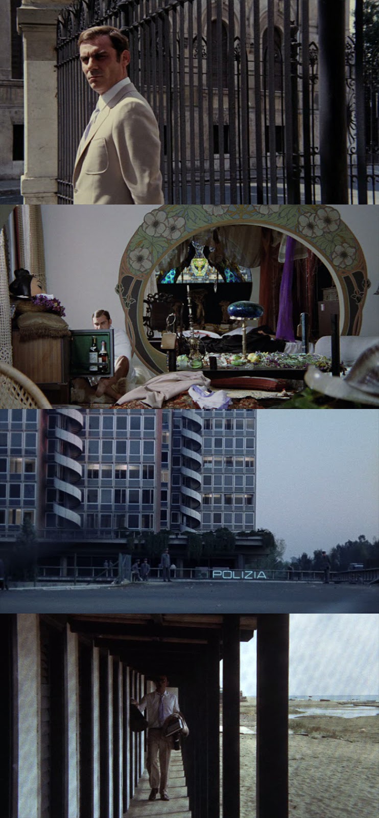
INDAGINE SU UN CITTADINO... (Petri, 1970): Patterns

Elio Petri's grim political parable INDAGINE SU UN CITTADINO AL DI SOPRA DI OGNI SOSPETTO (INVESTIGATION OF A CITIZEN ABOVE SUSPICION) is set in a city of rectangular concrete walls, blinds and bureaucratic drabness. Only the apartment of the protagonist's girl friend and murder victim is full of ornamental patterns.

Elio Petris groteske politische Parabel INDAGINE SU UN CITTADINO... spielt in einer Stadt voller rechtwinkliger Betonwände, Lamellenmustern und bürokratischer Trostlosigkeit. Einzig die Wohnung von Gian Maria Volontés Freundin und Mordopfer ist voller ornamentaler Muster.

bottom: in the beach scene there is a net in front of the lens that should probably soften and darken the image. However, with these deep focus lenses it is clearly visible and serves as an unintended pattern.


INDAGINE SU UN CITTADINO... (Petri, 1970): 50 blue ties for 50 dolls

If there is one stylistic trait that stands out in Elio Petri's INDAGINE SU UN CITTADINO... it is its cold and sober surface. Almost no colored lighting (in one scene there is a green tinge on two faces) and lots of gray and wood colored brown make the blue uniforms and the protagonist's azzurro tie come off as very cold. However, around the interrogation room in the police headquarter's basement there are some striking ochre windows the cinematographer uses as kind of an in-camera filter effect.

Das wohl auffälligste stilistische Merkmal von Elio Petris INDAGINE SU UN CITTADINO... ist die nüchtern kalte Oberfläche. Fast ausschliesslich weisses Licht (einzig in einer Szene erscheinen zwei Gesichter im Vordergrund betont grün) und viel Grau und Holzfarben im Hintergrund lassen die blauen Polizeiuniformen sowie die Krawatte des Protagonisten sehr kalt erscheinen. Um einen Verhörraum im Keller des Polizeireviers hat es jedoch auffällig ockerfarbene Glasscheiben , die der Kameramann sehr effektvoll einzusetzen weiss.

Freitag, 11. März 2016

DUEL (Spielberg, 1971): Red spot in the desert

In Steven Spielberg's debut feature DUEL (initially TV, reformatted for cinemas in Europe) the protagonist is driving through California in a red Plymouth Valiant. Because of its color the car is easily recognizable even in long shots.

In Steven Spielbergs Debut DUEL (ursprünglich fürs Fernsehen gedreht, dann für Europa zum Kinofilm ausgebaut) fährt der Protagonist in einem roten Plymouth Valiant durch Kalifornien. Dank seiner Farbe ist der Wagen auch in grossen Totalen einfach zu erkennen.


Freitag, 4. März 2016

SCOTT PILGRIM VS. THE WORLD (Wright, 2010): Comic book splitscreen

Director Edgar Wright is truly a visual storyteller. During the fight scenes of SCOTT PILGRIM VS. THE WORLD he achieves a stylized comic strip video game look not only through onscreen text and varying aspect ratios but by splitting the screen in most unusual ways that are usually only found in comic panels.

Der Regisseur Edgar Wright ist wahrhaft ein visueller Erzähler. Während der Kampfsequenzen von SCOTT PILGRIM VS. THE WORLD erzielt er beispielsweise einen stilisierten Comic-Videogame-Look nicht nur anhand von Text im Bild und wechselnden Bildformaten, sondern insbesondere durch ausgefallene Splitscreen-Einstellungen, wie man sie normalerweise nur in Comic-Panels findet.

[RV]

Freitag, 19. Februar 2016

MAD MAX: FURY ROAD (Miller, 2015): excessive blue/yellow

George Miller explicitly wanted FURY ROAD to not look washed out and pale like every other post-apocalyptic action movie. Therefore, the colorgrading team heightened the colors so much that the all too familiar "orange/teal" scheme was taken to such extremes that the artificiality prevents it from looking like anything Michael Bay would have worked on. If you want to see how the standard "stylish" washed out grading might have felt like, look no further than the publicity department's official stills that were all silver and beige and did not match the movie's look at all.

George Miller wollte explizit nicht, dass FURY ROAD so ausgewaschen und blass daherkommt wie die meisten andern postapokalyptischen Actionfilme. Darum überhöhte das Colorgrading Team das abgedroschene "orange/teal" Schema derart, dass die Bilder durch ihre Künstlichkeit nie mit jenen aus Michael Bays Filmen verwechselt werden könnten. Wer sehen möchte, wie das typisch ausgewaschene Hochglanz-Grading ausgesehen hätte, kann sich die silber-beigen Werbe-Stills des Publicity Departments anschauen, die den Stil des Films überhaupt nicht treffen.

[RV]

Extreme saturation and all blue, all yellow in the same frame. Just look at the crazy color of Max' shadow (top).

THE DANISH GIRL (Hooper, 2015): Refreshing use of the clichéd blue/yellow color scheme

The combination of the most obvious warm-cold contrast of blue vs yellow/gold has been the easy way out for uninspired film makers for over two decades now (if you are not familiar with the concept, see this famous orange/teal rant). It is most often connected to the rise of digital color grading but in fact has already surfaced in 1980s action films with warm and cold lighting. In THE DANISH GIRL (and some other films, of course), the combination of blue and gold looks very refreshing mainly because it is already there in front of the camera and has been planned in pre- not postproduction. Skintones and lighting look organic throughout the film, but costumes, paintings, sets and make up are carefully designed to bring the restrictive color palette to life.

Die Kombination des offensichtlichsten Warm-Kalt-Kontrasts von Blau und Gelb/Gold ist in den letzten zwei Jahrzehnten zu oft als einfacher Ausweg für phantasielose Filmemacher aufgefallen (ein beliebter Beitrag zum Thema "orange/teal" ist hier zu finden). Meist wird das Konzept mit dem Aufkommen des digitalen Color Grading verbunden, in Tat und Wahrheit kommt die allesübertönende kalte oder warme Beleuchtung bereits in Actionfilmen der 80er Jahre ausgiebig zum Zug. In THE DANISH GIRL (und anderen Filmen natürlich) wirkt die Kombination von Blau und Goldgelb so erfrischend, weil sie schon vor der Kamera existierte und in der Vorproduktion so geplant war. Hauttöne und Beleuchtung wirken durch den Film hindurch organisch. Kostüme, Gemälde, Sets und Make-Up sind hingegen sorgfältig aufeinander abgestimmt, um dieses sehr stilisierte Farbschema entstehen zu lassen.

[RV]

Colors don't have to be muted in postproduction if they are carefully chosen up front.

Freitag, 25. Dezember 2015

WRITTEN ON THE WIND (Sirk, 1956): Shadow patterns

Douglas Sirk's Eisenhower-era Technicolor melodramas are rife with heavy symbolism and lush production design. In WRITTEN ON THE WIND he likes to double frame the characters and place them behind windows. Often, they are partly obscured by shadowy patterns.

Douglas Sirks Technicolor Melodramen der Eisenhower-Ära zeichnen sich durch schwere Symbolik und opulente Ausstattung aus. In WRITTEN ON THE WIND zeigt er die Figuren besonders gern in Bildausschnitten innerhalb des Filmbilds und zeigt sie durch Fenster hindurch. Oft sind sie dabei teilweise von Schattenmmustern verdeckt.

Sirk's staging influenced Fassbinder's melodramas quite heavily.

Freitag, 11. Dezember 2015

[¨SAFE] (Haynes, 1995): Pastel red and green contrast

Todd Haynes's AIDS allegory [SAFE] about a chemical sensitive housewife is set in 1987 and alludes to melodrama mise-en-scène by both Sirk and Fassbinder. The art direction is quite heavy on all encompassing "wellness" pastel colors, very soft red and green (resulting in pink and turquoise) in particular.

Todd Haynes' AIDS-Allegorie [SAFE] über eine chemie-sensible Hausfrau spielt 1987 und enthält Anspielungen auf Melodrama-Inszenierungen von Sirk und Fassbinder. Wohlfühl-Pastellfarben sind sehr dominant, speziell ganz helles Rot und Grün (was zu Rosa und Türkis wird).

[RV]

Haynes focuses on carefully composed long shots.